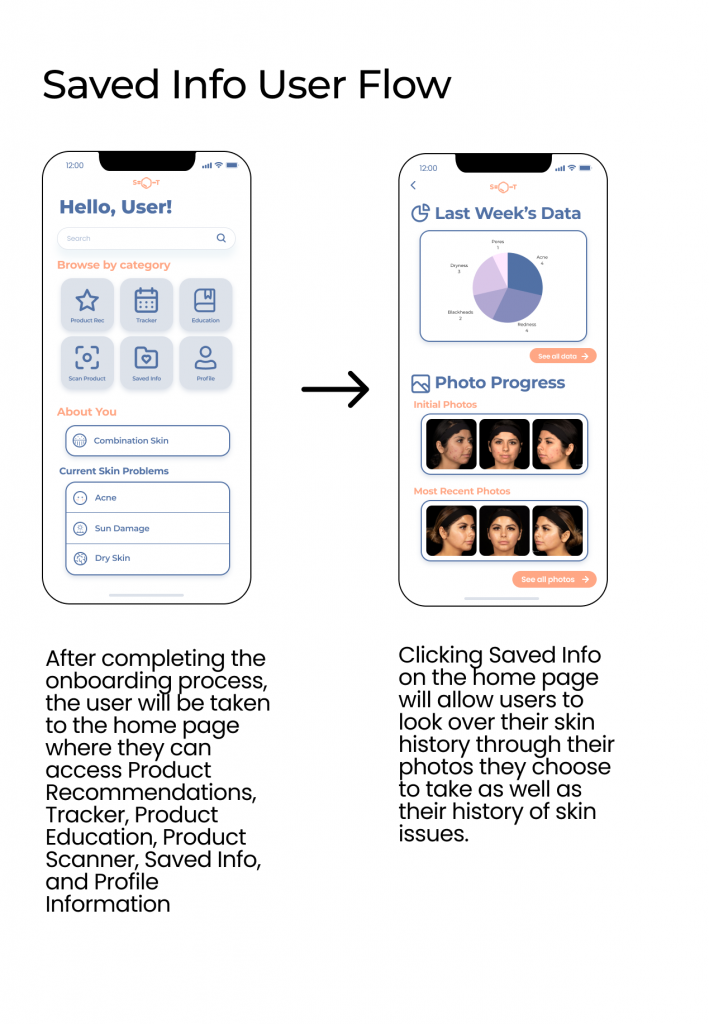
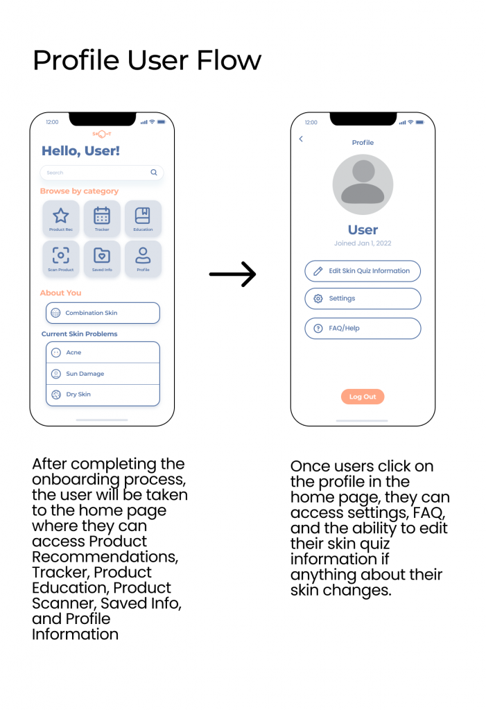
For my first ever UI/UX project under Product Design Project Teams with Design@UCI, my team and I designed an interface that aids users in their skincare journey. By providing a platform for users to document their skin progress, learn more about skincare in a digestible format, and monitor ingredients they have used, SkinTrack helps users take a personalized approach towards their skin and navigate the intimidating amount of skincare information out there.
My Role
- UX Researcher/ UI Designer
Team Members
- Joseph T. (me)
- Katelyn L.
- Amy L.
- Alyssa R.
- Wandy K.
Tools
- Figma
- Google Suite
Duration
- 8 weeks
02 The Problem


Difficulty Navigating Resources
People are running into skin problems and are not sure where they can seek help from or what ingredients are good for their skin.
Affordability
There is a lack of trusted skincare provider that is affordable.
Lack of Knowledge
There is a lack of knowledge on which skincare products are good for our skin.
Problem Statement
How might we help users feel more confident in navigating their skincare journey and empower them with the tool to comprehensively digest the landscape of skincare information?
The Purpose
This product strives to provide users with reliable and credible information about skincare products and ingredients. Many people, especially adolescents and teens, do not know which ingredients to use and avoid. It will help them incur skincare knowledge and know what they are using on their skin.
03 Discovery
Throughout the design process, I conducted most of the user research through competitive analysis and user surveys to understand how current products serve users, who our target audience is, and what they were looking for in our product that competitors don’t adequately address.
Competitor Research
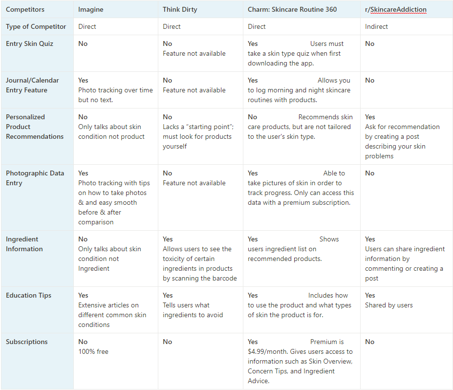
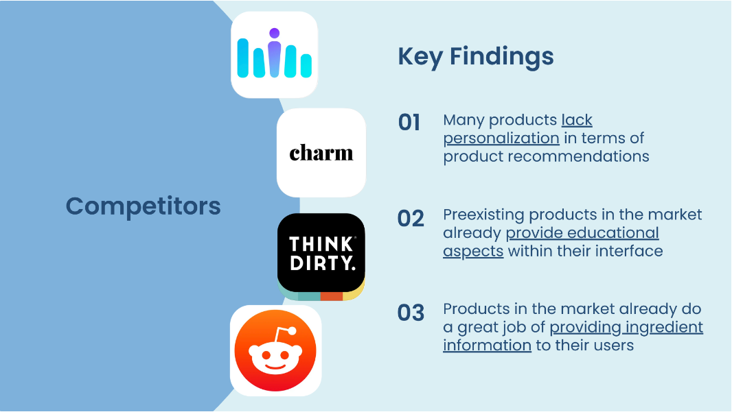
I conducted competitive analysis by comparing the presence of key helpful features for users across existing skincare platforms.
Key Findings
From analyzing existing products out there, I found three key findings about competing products.
User Research
We conducted User Research primarily through user surveys using Google Forms.

User Survey Focus
- Who are our users/target audience? (age, gender, etc.)
- How much do our users know about skincare and how do they get this information?
- What are our users’ experiences with skincare?
- What features are users looking for in a skincare interface?
User Survey Google Form
Key Findings
What I learned about our users?
Key Finding #01
Most of the users who filled out the survey already have skincare routines but are not completely satisfied with their skin.
Key Finding #02
Our target audience are primarily skin conscious young adults who are around 18-25 years old.
What did users want from our product?
common direct answers from user surveys to determine necessary features and inform design choices
“scanning current skincare products so if you change your routine to different products”
“maybe like an active feedback that tells you possible reasons for your skin reacting a certain way”
“a calendar where i can also note down if i had my period to see if my breakout is hormonal”
04 Design Process
Low to Mid-fidelity Wireframes
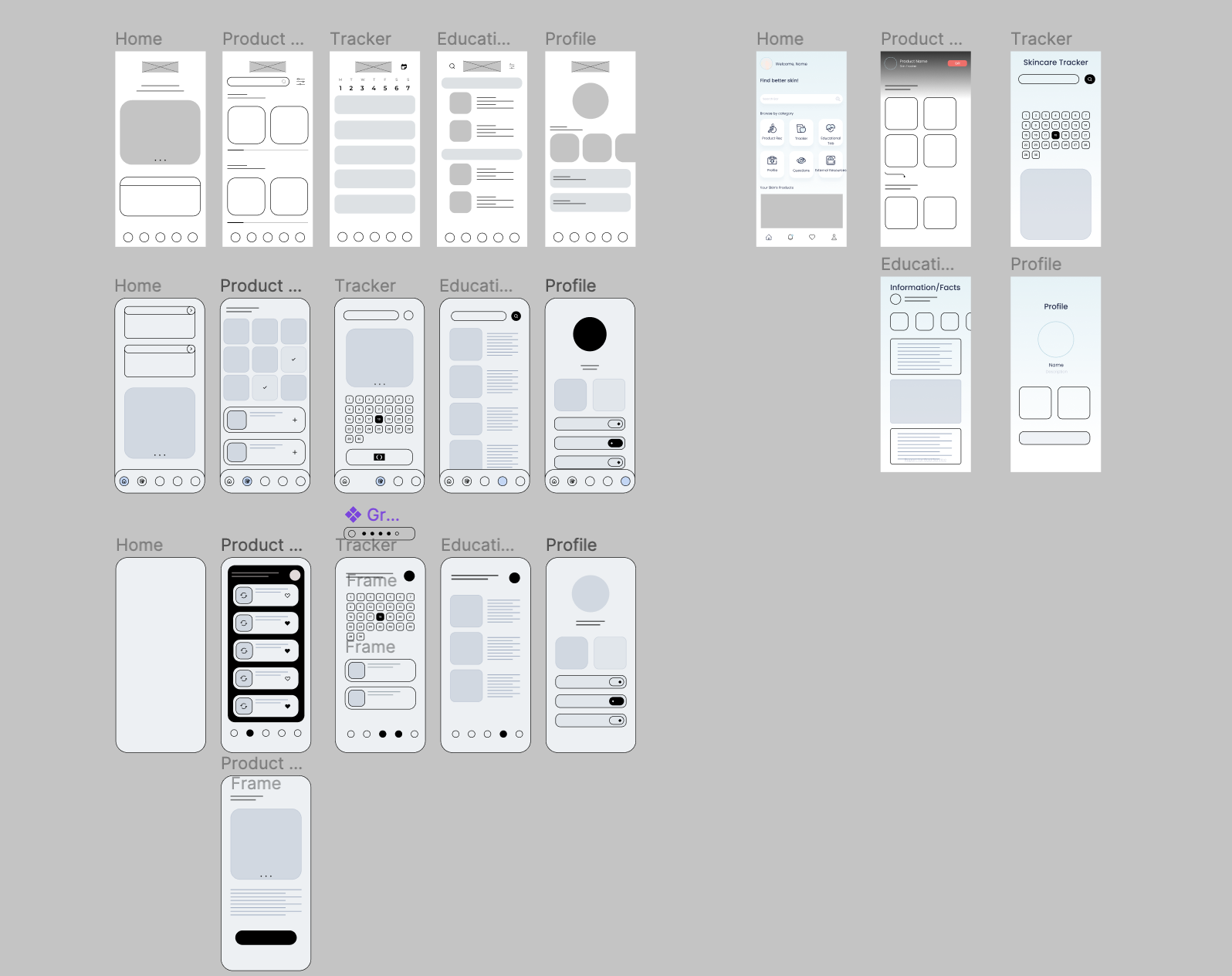
Wireframes created by each team member
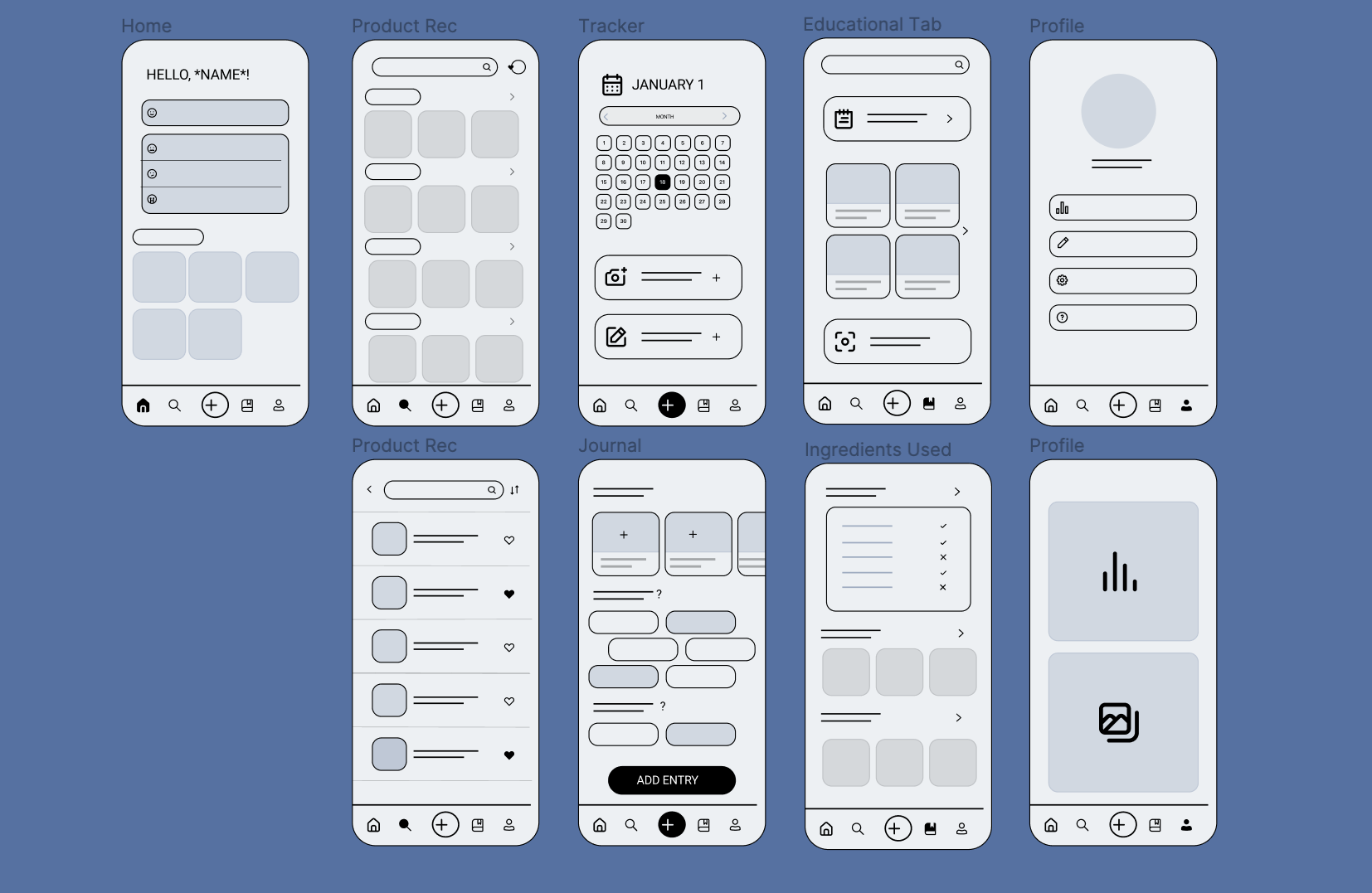
Since many of the group members were beginners at product design, we each designed our own set of key low fidelity wireframes and later came together to create a finalized set of low fidelity wireframes we were going to base higher fidelity designs/iterations on.
Agreed Upon Wireframes
We agreed upon these wireframes because they gave us a good starting to base higher fidelity designs on and displayed the features we wanted in our product in an understandable way.
From the process of designing various low fidelity wireframes with our user research findings in mind we decided to include these key features in our product (can be seen in the below wireframes): Product Recommendation, Tracker, Educational Tab, and Journal
Ideation
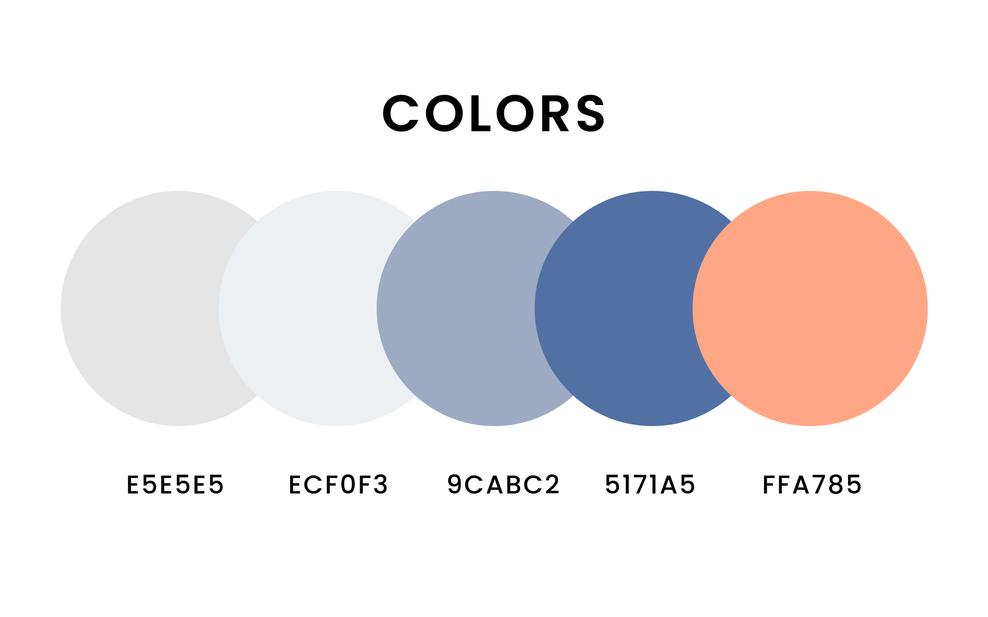
When discussing color with the design team, I proposed on a blue color range to communicate cleanliness within our product. Since blue is a common color used in major skincare brands’ marketing and packaging designs, I thought it would be a suitable design choice to user for our product. The pastel orange was added into the color palette to act as an contrasting, accent color to draw attention to important element within the product.
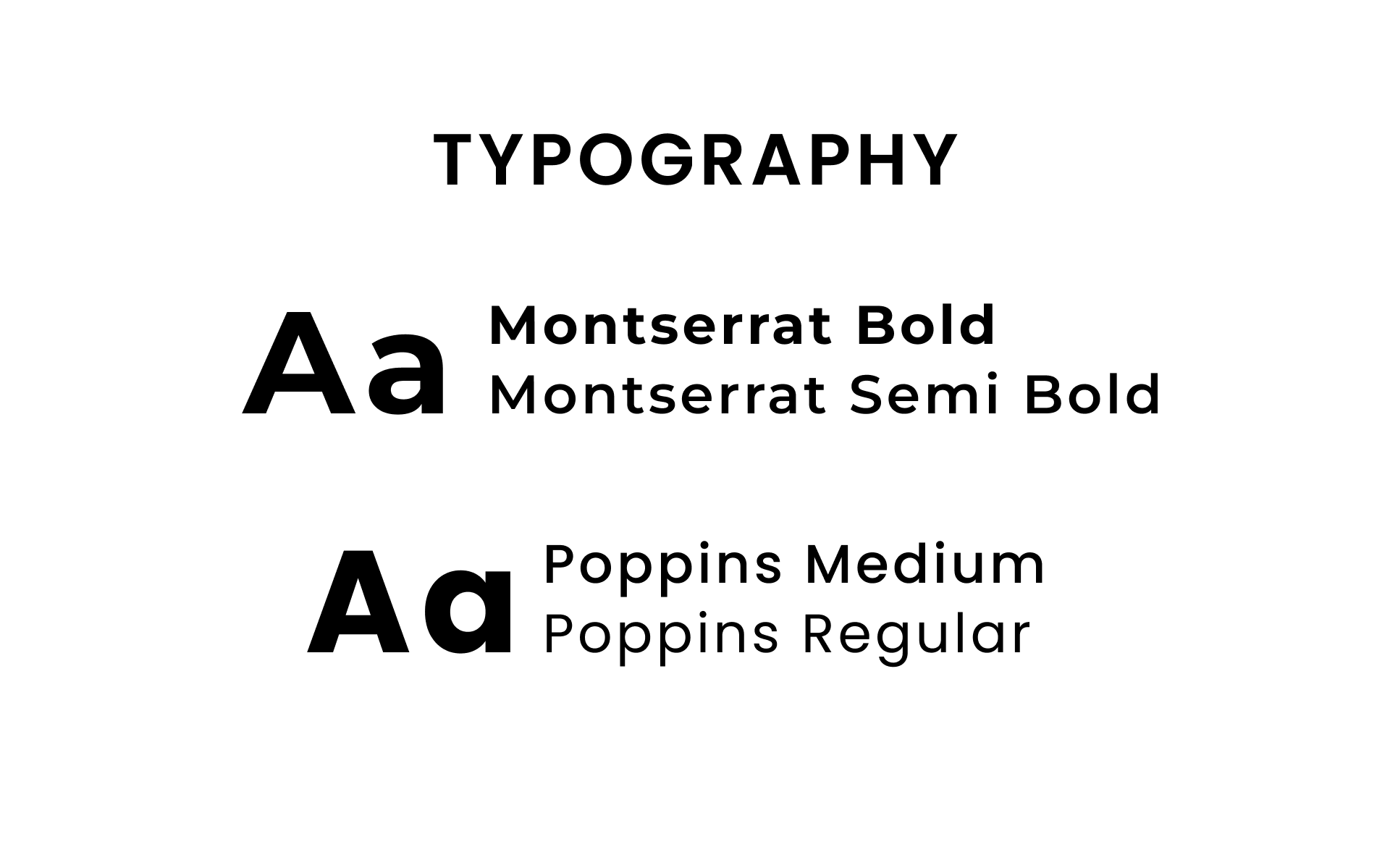
For typography, I also proposed we used modern fonts such as Montserrat and Poppins. I proposed these serif fonts to establish an easy-to-read typeface and to further communicate that “clean” messaging within our app.
05 Determining User Flows and Design
Determining User Flows
Due to time constraints and the short duration of this project, our team was unable to conduct usability testing and experiment with various user flows. However, the team decided that these flows were the most appropriate for many reasons.
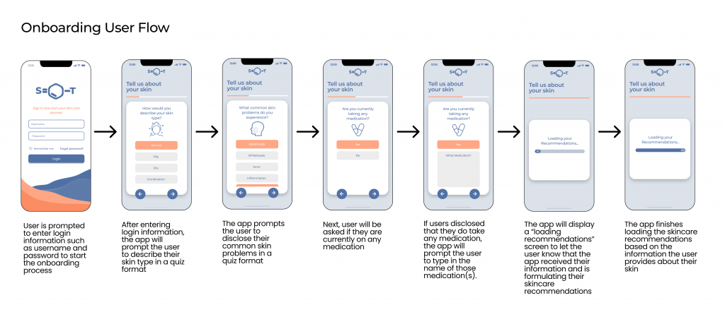
Onboarding Users in a Quiz Format (Onboarding User Flow)
Our team wanted to create flows that were familiar and comfortable for users to interact with. Common online skincare services like Curology usually onboarded users by gathering information around their skin in a simple, easy to follow quiz format.
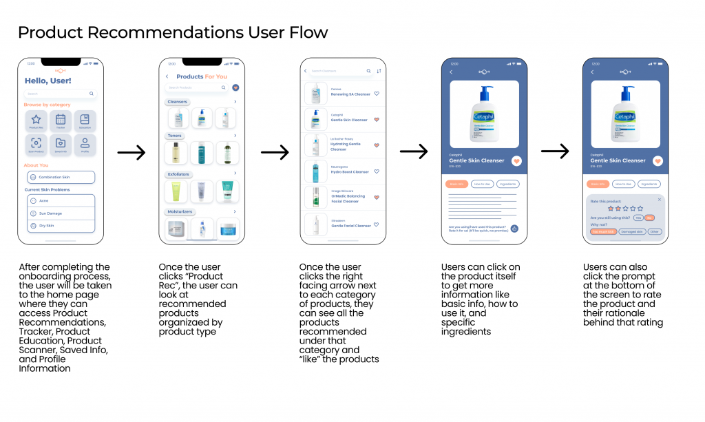
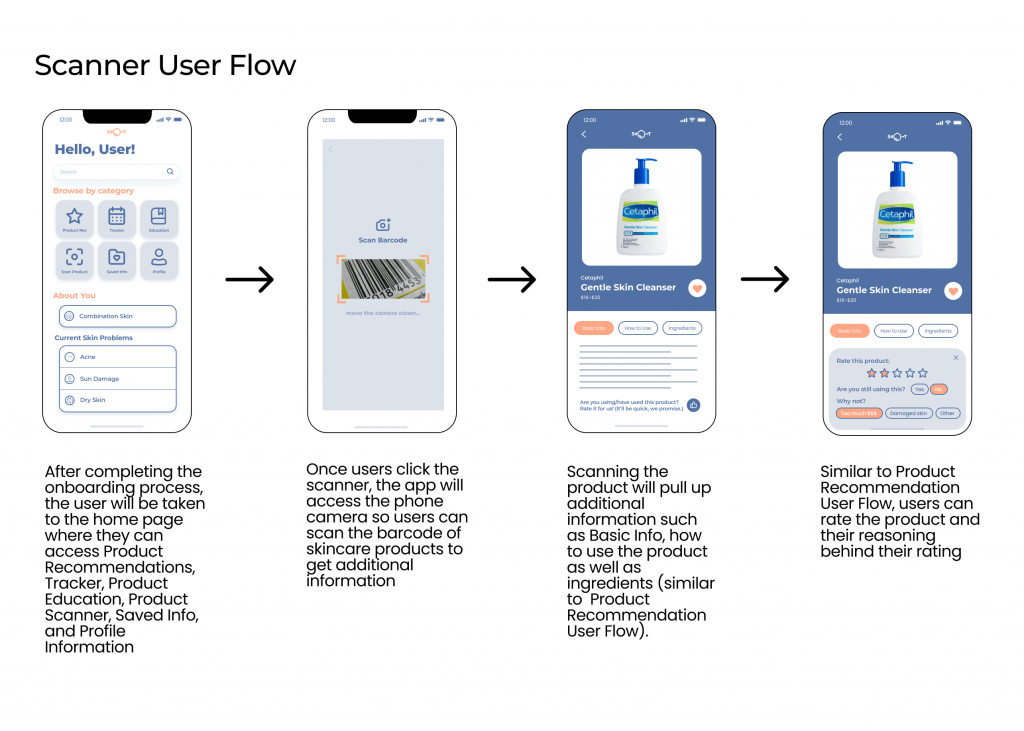
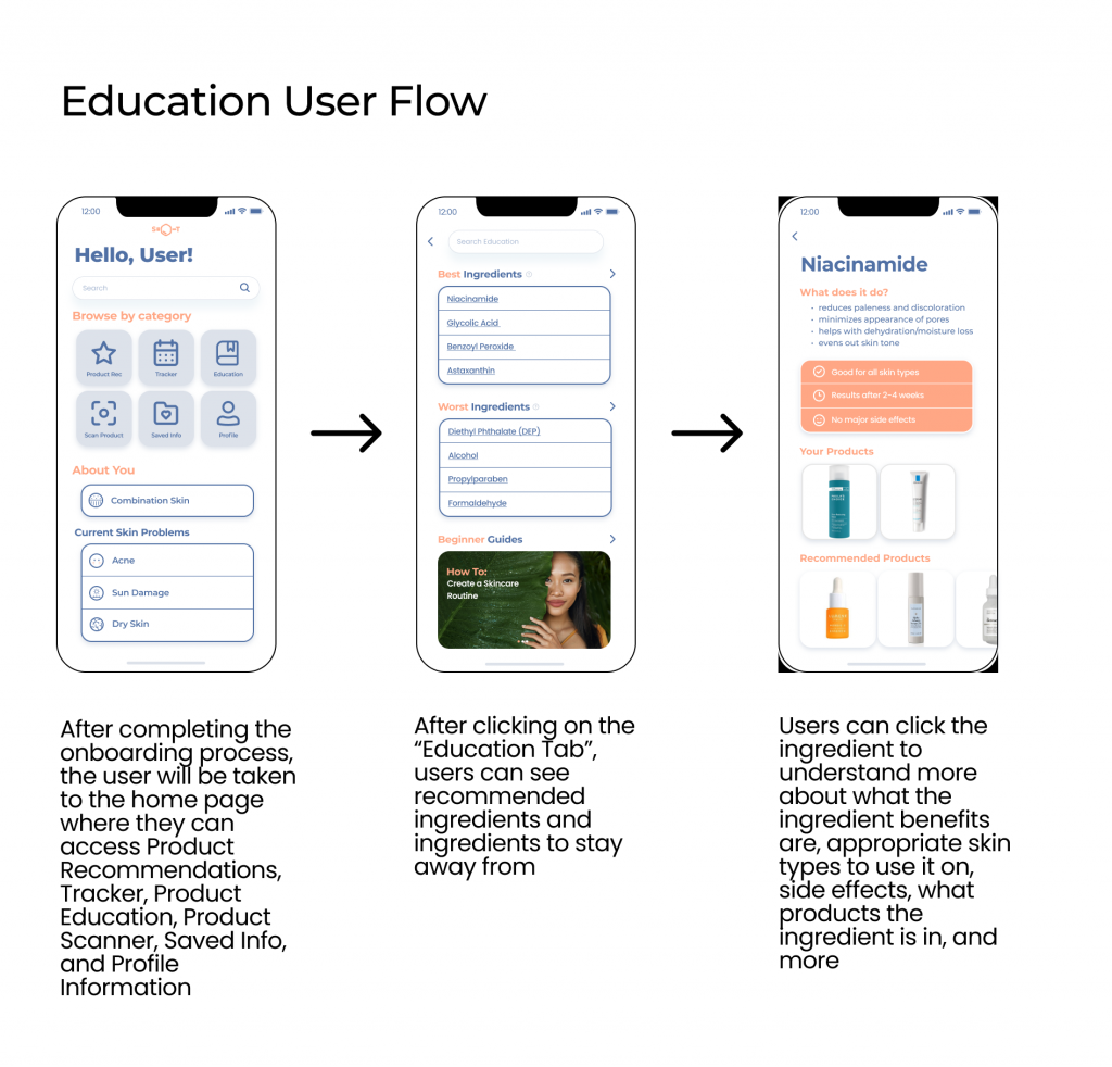
Starting Flows from the Home Page
We wanted a majority of the flows to stem from the Home Page. While apps usually have navigation bars at the bottom of the screen, our team believed that having a dashboard style Home Page to begin every flow would be easier for users to interact with since our product attempts to implement many features. Users would overall have an easier time navigating the product and its features in this way.
Design Decisions
For the high fidelity, I primarily worked on the Onboarding Flow and decided to include the following elements.
Rounded Corners and Drop Shadow for the Question Box to reduce harshness in the design and establish hierarchy in the design compared to other elements
Progress Bar to provide constant feedback to users to ensure they know their progress during the onboarding process
Adding “Tell Us About Your Skin” to not only prompt users to a specific action but to also the onboarding process feel more personalized to the user
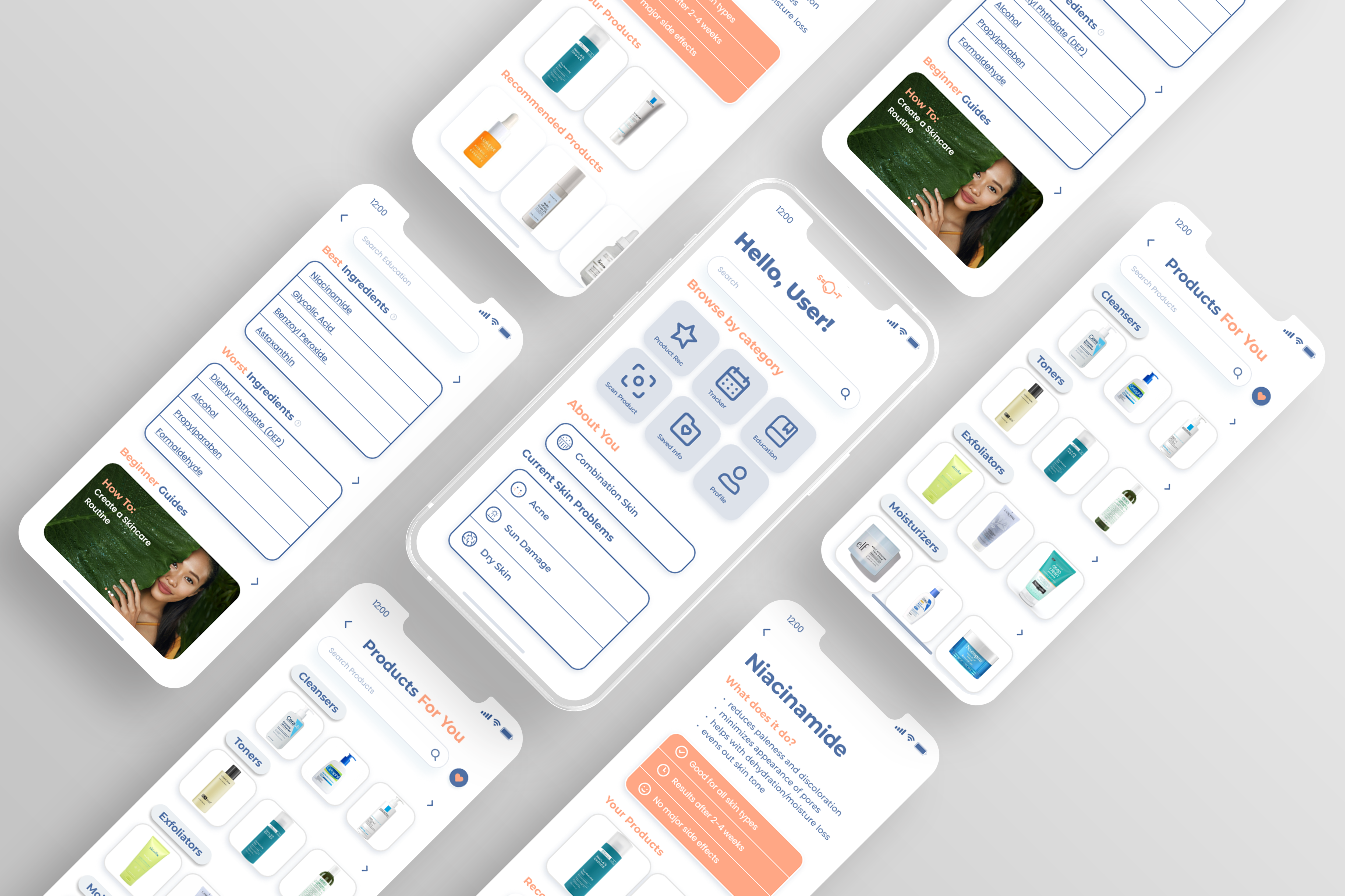
06 Improvements and Final Design
07 Reflection
Because this was the first design project for all the team members, going through the entire design process allowed us to reflect on what we would change around time management, research methods, and designs.
We could have allocated more time into learning about how to implement animations in Figma. Implementing animations would have made the prototype more cohesive and resemble and actual product.
For the user research, we should have added more specific questions such as what type of products they have seen or used, in order to get some insight into which products are popularized in which do not work or do work.
We could have also had better time management so that we could conduct usability testing so that we could experiment with various user flows and iterate on wireframes to make the best possible product.
In order to critically evaluate users and user data, interviews should have been carried out. By conducting User Interviews, we would’ve have gotten a better sense of the thought process of our users and make more appropriate adjustments accordingly.
