I chose to explore an e-commerce problem space because of how compelled I feel to improve the online shopping experience. The market is huge with an expected $1 trillion in US e-commerce sales in 2022 and there are numerous opportunities to advance what exists today.
Role
Duration
3.5 Months
Platform
Industry
- E-commerce
- Retail
Tools
- Figma
- FigJam
- Notion
- Google Suite
Reliance on Online Retail is Growing Recently
9.0
Expected Increase in Online Clothing Returns
75
Sizing is One of the Main Reason for Returns
55
02 The Backstory
Since the pandemic, online retail sales have gone up. However, so too has the rate of returns. Customers have found it increasingly difficult to assess the clothes they purchase online because of sizing differences and a disparity in material quality. The emergence of bracketing–the practice of customers buying many items with the explicit plan to immediately return some or all– is unsustainable and detrimental to customers and the business.
Target Audience
Ages 18-24, with diverse clothing styles, and use online shopping as their main source of getting clothes
Problem Statement
How might we improve the online shopping experience for fashion sites so that users feel more confident about the expectations of their clothing purchases?
My Purpose and Goals
Purpose
The purpose of the product is meant to improve the online shopping experience by ensuring that the clothes they purchase online are up to their expectations and standards.
Therefore we want to…
Reduce Returns
Reduce the percentage of items being returned because of not meeting quality expectations
Reduce Costs for Businesses
Alleviate overhead costs from processing returns.
Improve the online shopping experience
Help customers feel confident with their online purchases by meeting their quality expectations
03 Discovery
User Research
What I wanted to learn from our users:
- Online shopping experiences and habits
- What makes users more confident when purchasing clothes
- Reasons why they are unsatisfied with their buying decisions
- Criteria they abide by when choosing to make a purchase
User Interviews
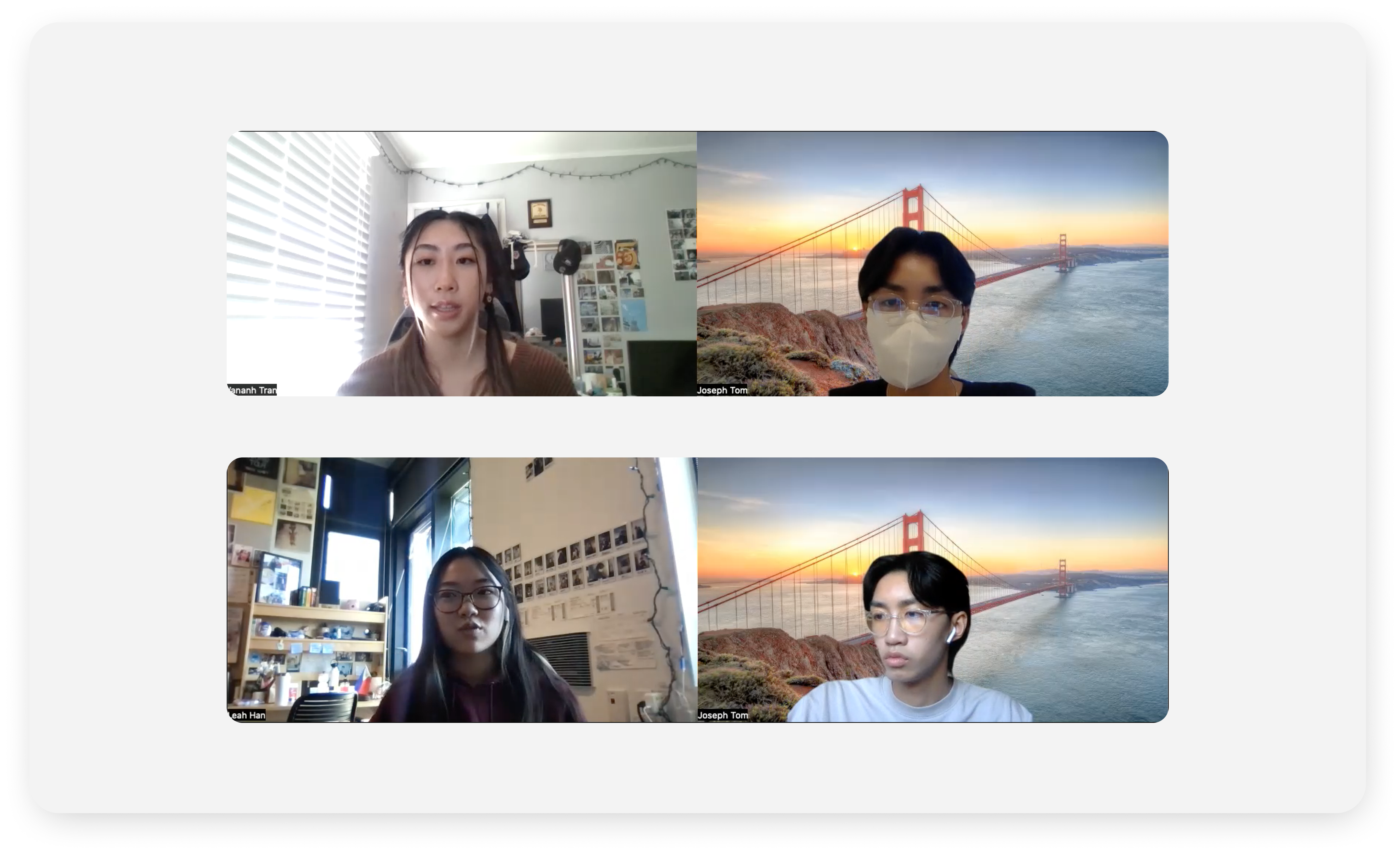
In addition to user surveys, I conducted user interviews to host a platform for users to express their opinions and get more in-depth insights about how their general lifestyles influence their online shopping experience, a walk-through of their current methods for online shopping, and what an ideal product would look like for them
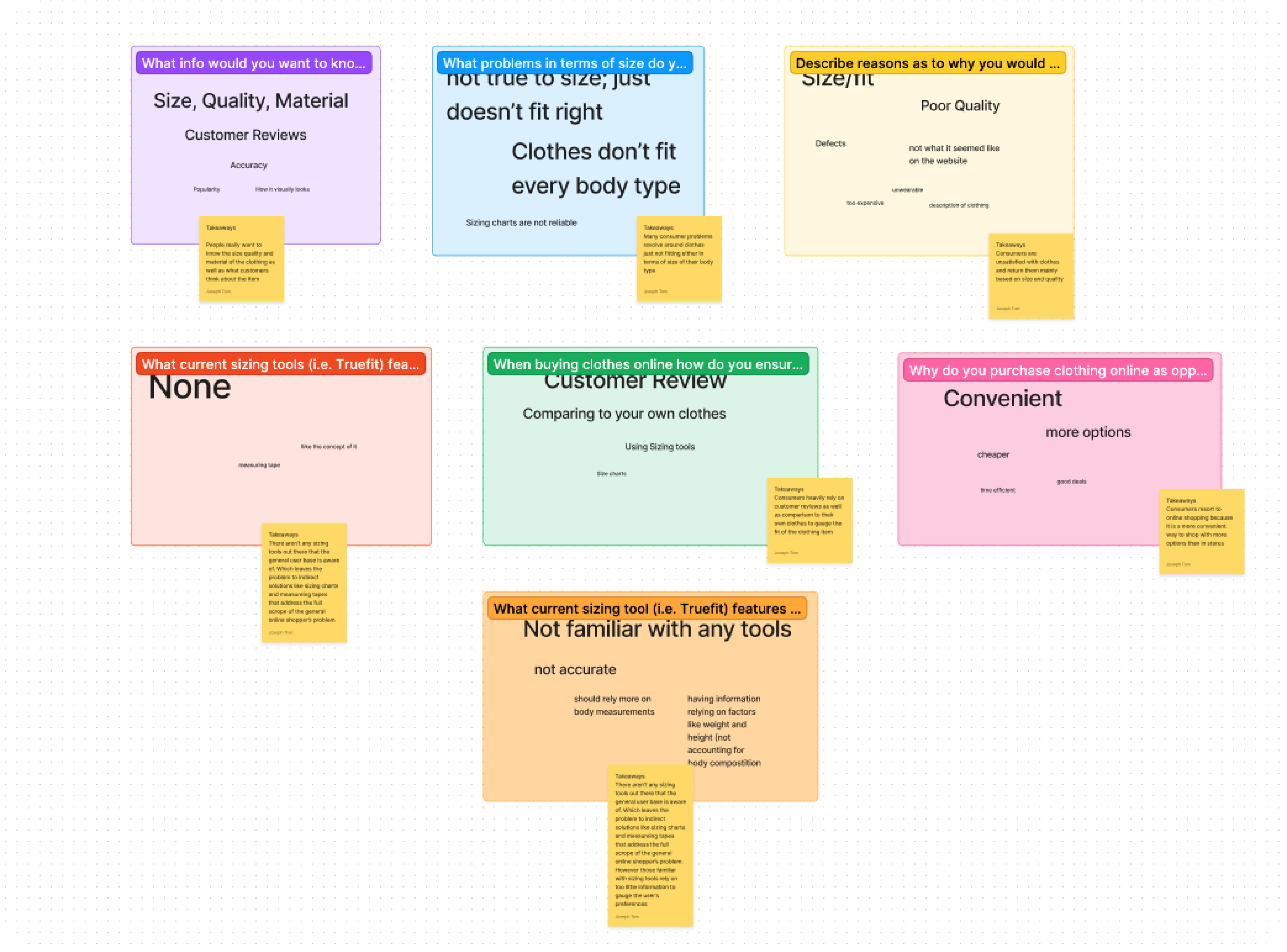
User Survey and Interview Findings
Size, Quality, and Material are Important
Users mainly look at the size, quality, and material of clothes when purchasing clothing items
Current Sizing Tools Rely on Too Little Information
They should include more reliable metrics like specific body measurements and personal preferences
More Interaction between Customers is Needed
A more in-depth interaction between customers would be helpful in an online shopping experience
Unawareness of Existing Sizing Tools
Users are unaware of any mainstream sizing tools that are meant to aid users in purchasing clothes
Competitive Analysis
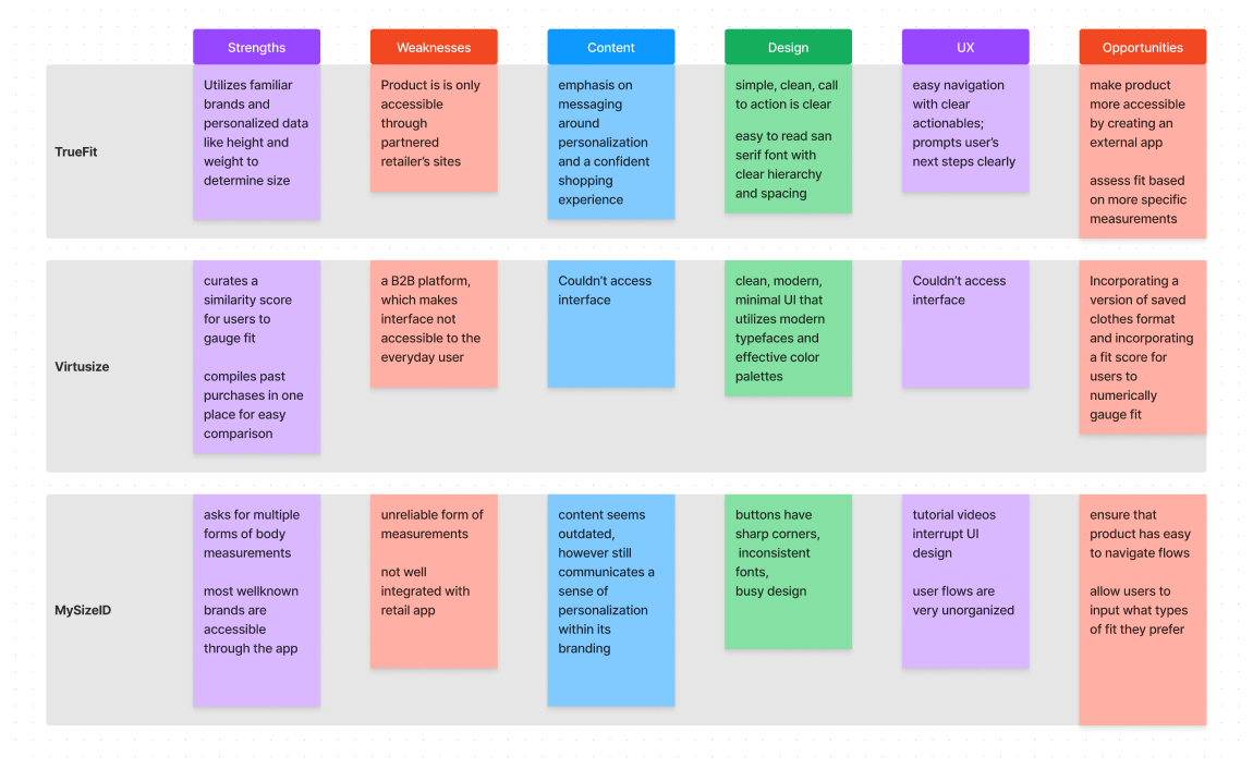
I wanted to understand what issues have been solved with preexisting products and what is missing from these products that can be addressed with FitRoom. I examined
- Strengths
- Weaknesses
- Content
- Design
- UX
- Opportunities
Competitve Analysis Findings
Sizing Tools are Marketed Towards Business Rather than Shoppers
Many preexisting sizing tools are targeted toward businesses, leaving customers out of the equation and leaving no room for in-depth personalization.
Current Products are Offered in Limited Platforms Options
Sizing tools usually come in the form of plugin applications that are only available on partnered brands’ shopping sites.
Clean, Minimal, and Consistent UI Achieves the Best Results
The products with clean, minimal, and consistent UI subconsciously provided a better experience in terms of usability and trustworthiness of the product.
04 Design
Low Fidelity Sketches
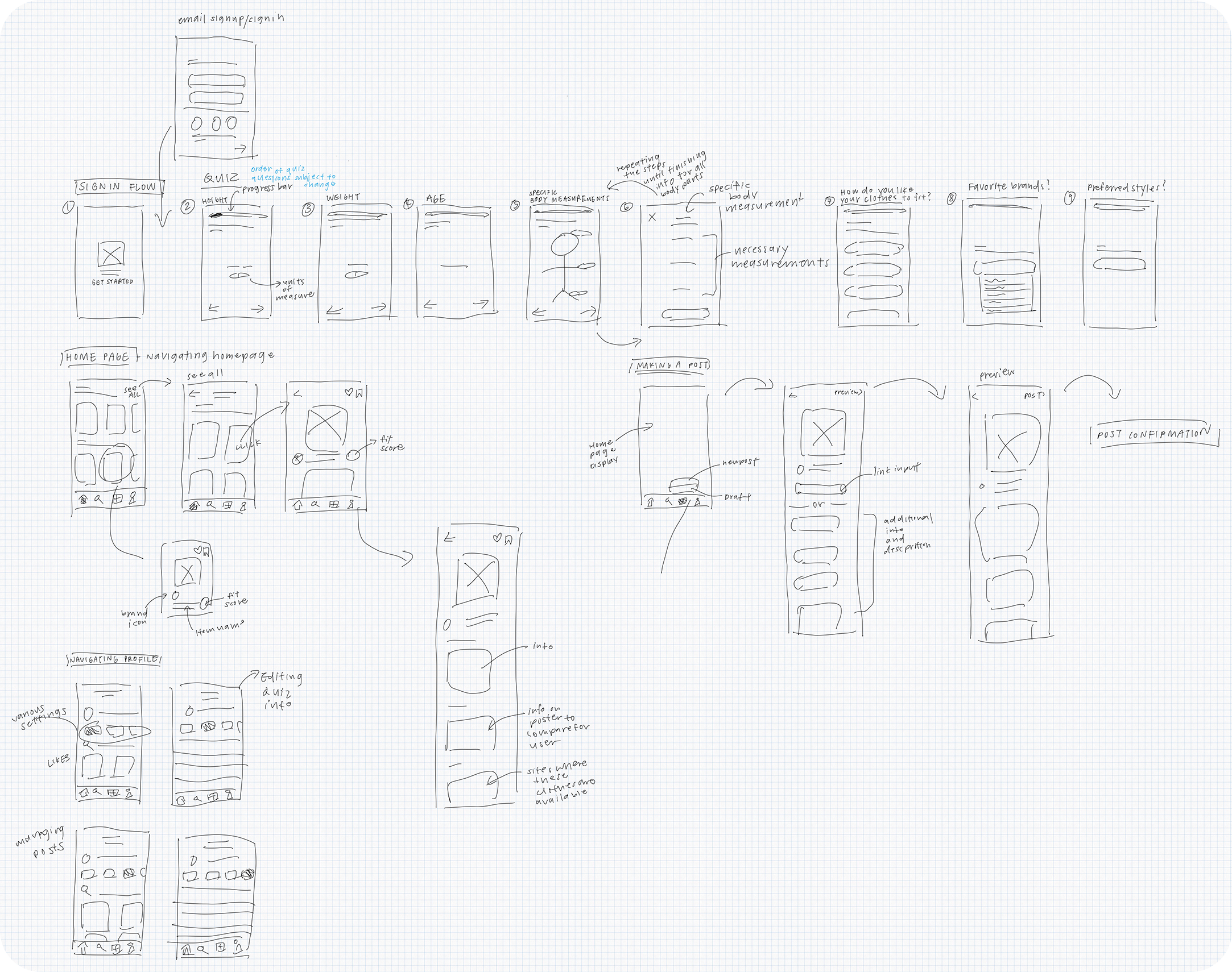
I began my design process by drafting up low-fidelity sketches of various flows and screen layouts in a way that allowed for low stake revisions and experimentation.
Organizing User Flows
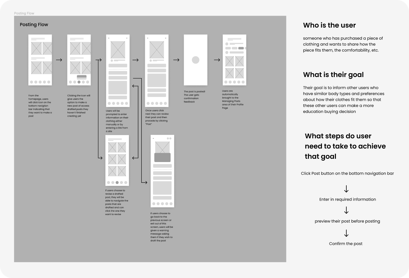
I arranged these low-fidelity wireframes into user flows to get into the mind of users and understand how they would complete certain tasks and navigate the product.
With every user flow, I asked who are the users, what goal do they want to accomplish, and what steps they needed to take to achieve that goal.
Performing this exercise with each user flow, allowed me to find missing steps that I needed for a task to be complete and more efficient ways to get users from point A to B.
Implementing a Design System (High Fidelity Wireframes)
Once I solidified my user flows from the low fidelity wireframe stage, I proceeded to determine a proper design system and set of design principles that would best serve my users. My design system is created to allow for fluid navigation, consistency, proper brand messaging, and easy engineering handoff.
Color
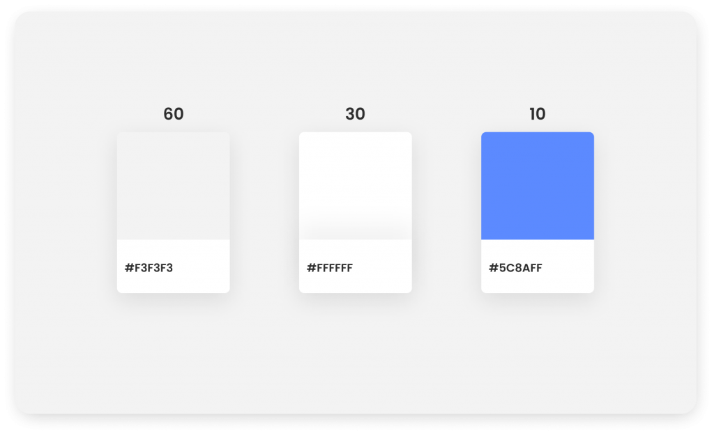
For the color scheme of the product, I wanted to incorporate the 60-30-10 rule to create a minimal, easy-to-navigate experience for my users.
Incorporating blue as my accent color helps the product signal confidence and trustworthiness while also differentiating itself from competing products that use red in its branding.
Typography
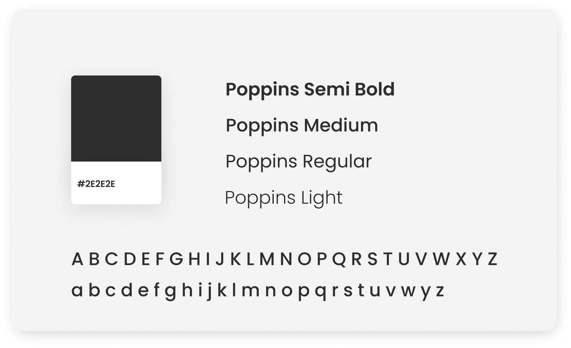
Poppins was an ideal typeface to use because its san serif typeface, which is modern and easy to read and aligns with my user base who are young adults accustomed to modernism.
For text, instead of pure black (#000000), I decided to assign #2e2e2e as the text color to lessen the harsh contrast and subconsciously give my users a less strenuous visual experience.
Layout
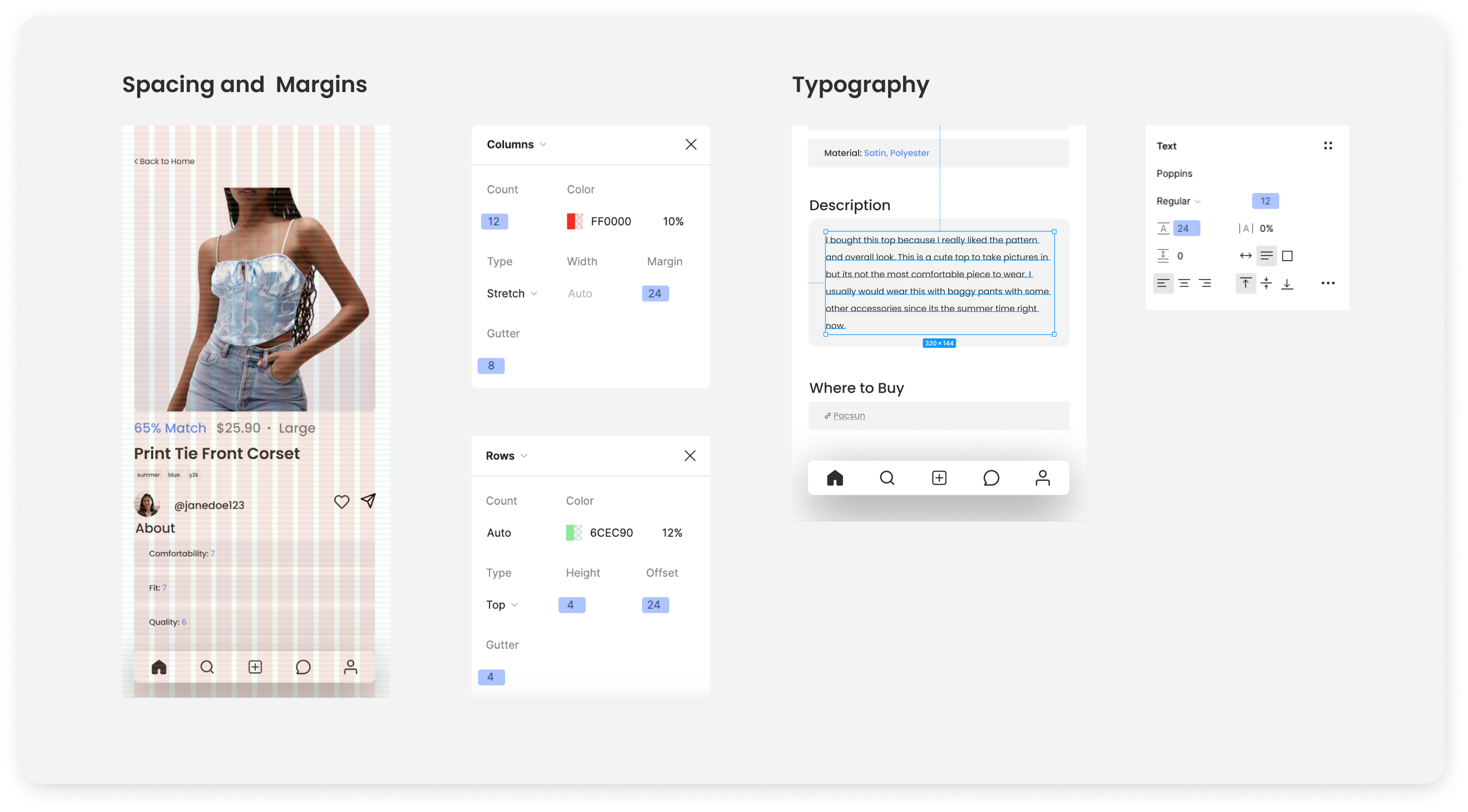
I decided to incorporate multiples of 4px to establish an underlying structure of consistency throughout my designs. Establishing this consistency helped the product with adopting vertical rhythm, proper alignment, and a professional visual design.
Font Size
I primarily used font sizes that were divisible by 4 (8pt, 12pt, 16pt, 20pt, and 24 pt) to create consistency throughout my text and establish a clear hierarchy with screens that held a lot of content.
Spacing and Margins
For spacing, I incorporated a layout grid with a baseline grid height of 4px so I could use easily scalable line heights with text-heavy UI elements. Margins were set at 24 px to be consistent with the baseline gridding.
Design Principles: The Wayfinding System
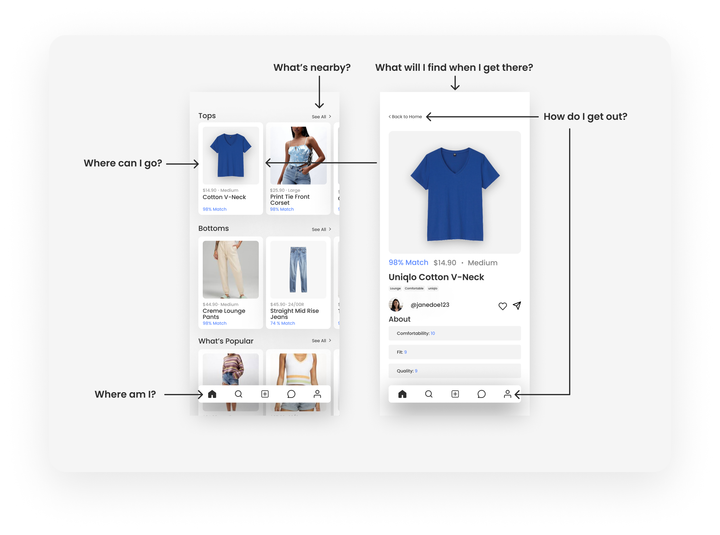
Because I was designing for a user base that primarily uses Apple products I wanted to incorporate Apple design principles into my designs, specifically the Wayfinding System discussed at the Worldwide Developers Conference. To adhere to the Wayfinding System principle, I made sure that all my designs helped users answer these five questions
-
- Where am I?
- Where can I go?
- What will I find when I get there?
- What’s nearby?
- How do I get out?
05 Usability Testing
After showing my prototype to stakeholders, I found key design issues and flow issues that disrupted the usability of the product.
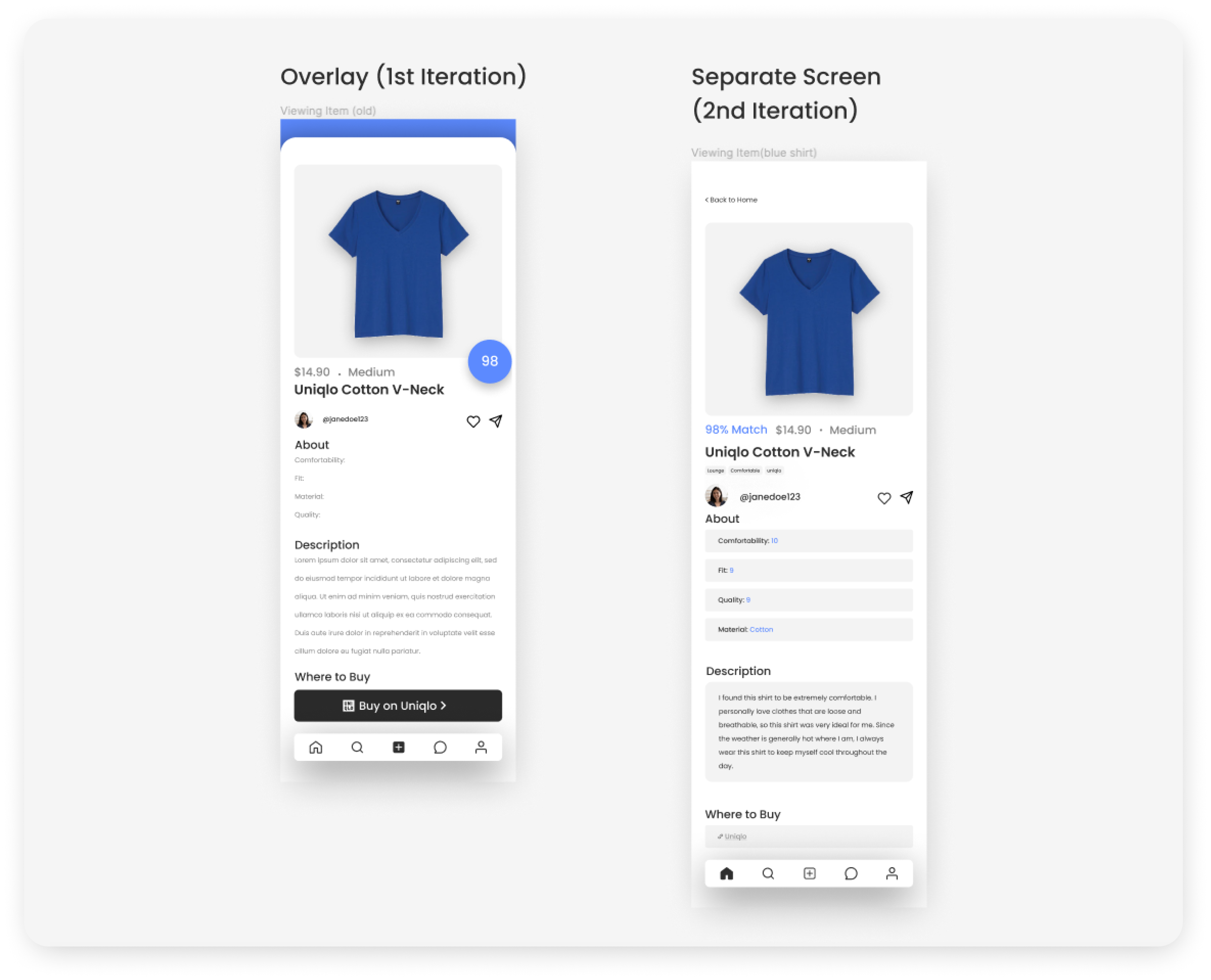
Viewing Items
I found that my users did not particularly enjoy the experience of viewing an item. Reviewing my “Viewing Item” wireframes, I noticed that some content did not align with my design system. I iterated upon these wireframes to clarify the hierarchy and consistency.
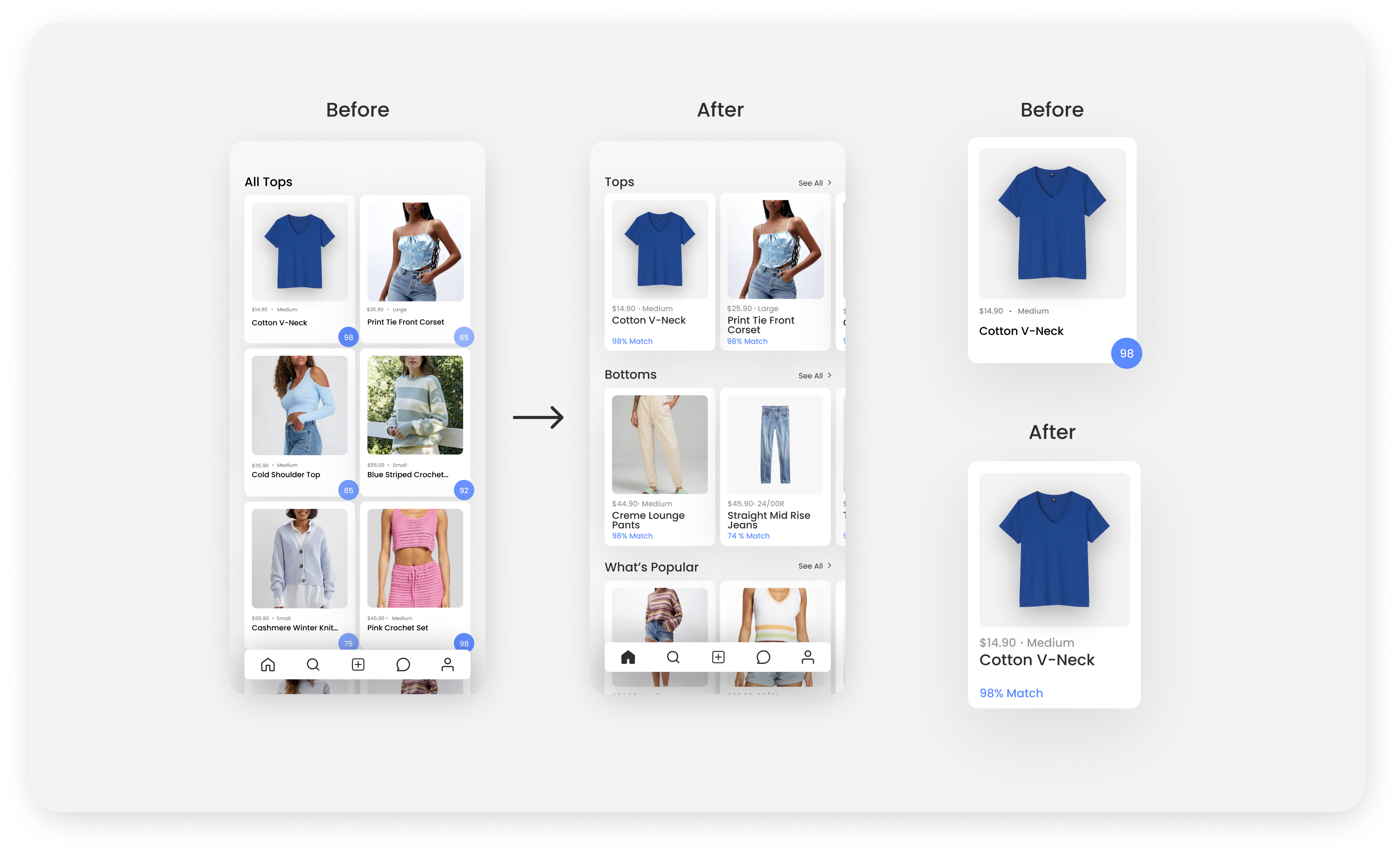
Photocards
My users also demonstrated concerns around the readability of the UI cards in my product, one of the main, significant components in my product. I enlargened the text to be easily readable and changed the match score to be simple text, so users can easily recognize what the function of the score is.
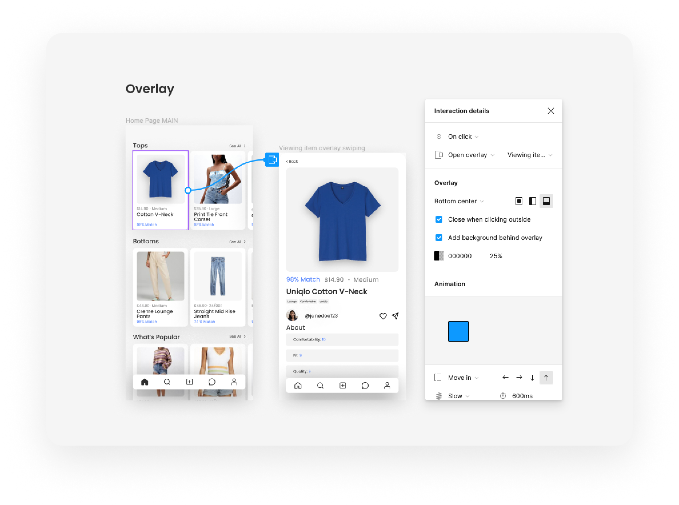
Redesigning Overlays
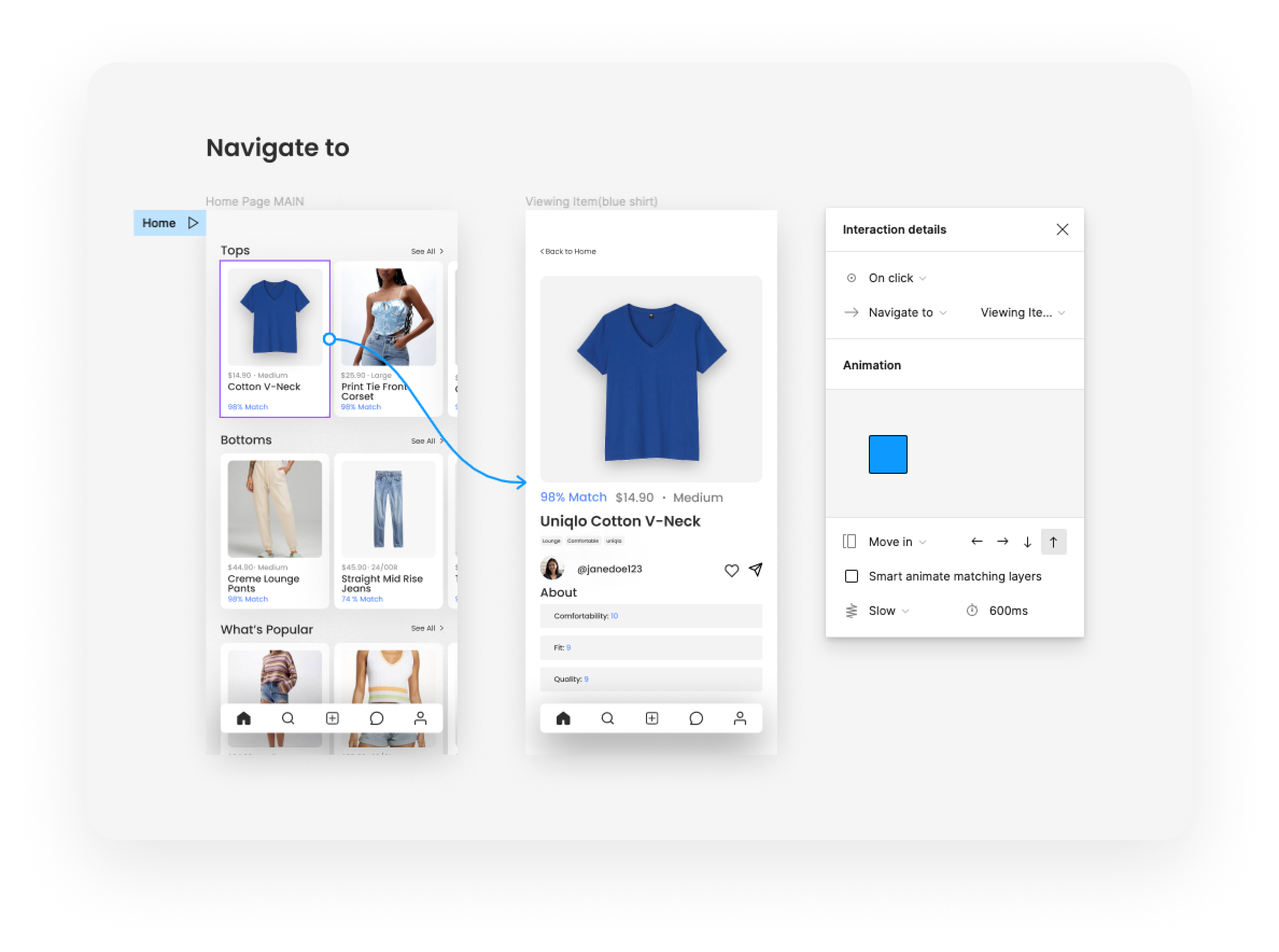
I originally designed the majority of user flows with overlays to indicate that they were a subset of main pages from the navigation bar like the Home Page, Search Page, etc. However, I found that incorporating overlays confused users on how to navigate back to previous screens and caused issues when prototyping.
I redesigned these overlays as separate screens to make the prototyping process more efficient and easier for users to navigate.
06 Reflection
After showing my prototype to stakeholders, I found key design issues and flow issues that disrupted the usability of the product.
Measuring Impact
Because this was a solo passion project, I did not have the resources to assess the impact of my project directly. However to assess the helpfulness of my product I would focus on metrics like return rates, conversion rates of the app to third-party shopping sites, as well as personal satisfaction with purchased clothes
Time Management
Since this was a passion project, I was not met with hard deadlines to complete certain stages of the design process. To manage my time more efficiently and set a more rigid schedule, I would time-box each step of the process to ensure that each step is given enough weight and importance while also finishing the project in a timely manner.
Learn Before Doing
My natural work style is to immerse myself in projects and learn while doing. However, there were stages in the prototyping process where I found that it would have been better to review various prototyping flows before incorporating them into my product. This way I could determine the best approach from the various prototyping flows.